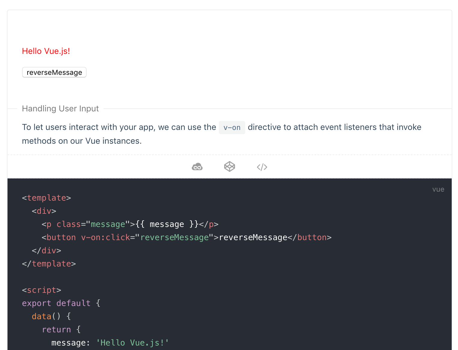
vue-demo-box
vue-demo-box provides a container component that presents both the demo and the code. For more demonstrations, check out the Example.
Recommended to use with Vuepress import code snippets to make it easier to reuse the code to create a presentation:
Install
yarn add -D @laomao800/vue-demo-box

# or

npm install --save-dev @laomao800/vue-demo-box
API
Props
| prop | type | default | description |
|---|---|---|---|
| title | String | undefined | demo block title |
| jsfiddle | Boolean | true | whether shows jsfiddle link icon |
| codepen | Boolean | true | whether shows codepen link icon |
| jsRes | Array | [] | external js resources links |
| cssRes | Array | [] | external css resources links |
| horizon | Boolean | false | horizon layout |
| codeHeight | Number / String | - | code area max-height |
Where 'jsRes' and 'cssRes' are only used as external resources in the demonstrations site, does not load inside the component.
Slots
| name | description |
|---|---|
| default | description content |
| demo | demo content |
| code | code content |
Global config
Components can globally configured when importing, supports props:
| prop | description |
|---|---|
| jsfiddle | show by default |
| codepen | show by default |
| jsRes | default resouces, will merge with props |
| cssRes | default resouces, will merge with props |
import Vue from 'vue'
import DemoBox from '@laomao800/vue-demo-box'

Vue.use(DemoBox)

/*
Vue.use(DemoBox, {
  jsfiddle: false,
  codepen: true,
  jsRes: [
    '//unpkg.com/vue/dist/vue.js',
    '//unpkg.com/element-ui@2.12.0/lib/index.js'
  ],
  cssRes: [
    '//unpkg.com/element-ui@2.12.0/lib/theme-chalk/index.css'
  ]
})
*/